
Stimulating visitors' learning and engagement through art labels in Rijksmuseum
How can we design for learning when the truth is painful?
In an era where museums are shifting from neutral repositories to emotionally resonant, socially engaged spaces, I set out to explore a complex challenge: Can exhibit labels influence how museum visitors emotionally engage with, and learn from, slavery-related exhibits?
For this project,
conducted in collaboration with the Rijksmuseum in the Netherlands, I designed and conducted an in-situ experimental study using eye-tracking technology, emotion surveys, and interviews to test how different types of exhibit labels (traditional, slavery-contextualised, or none) affect visitor engagement and recall.
Problem
Museums are central to public education about the history of slavery — but how to engage visitors meaningfully remains unclear.
Following the Netherlands’ official apology for its role in the transatlantic slave trade, the government committed €200 million to slavery-related education. Museums — especially national institutions like the Rijksmuseum — are at the heart of this effort.
We wanted to understand:

How will visitors respond to information about their country’s role in slavery?
Can exhibit labels foster engagement and learning, or will emotional discomfort lead to disengagement?
These questions shaped the foundation of this research project — a collaboration between the Rijksmuseum and Leiden University’s Cognitive Psychology faculty.
Goal
This project aimed to understand how different exhibit labels influence visitors':

Emotional responses


Visual attention
Learning outcomes
Specifically, we tested whether slavery-contextualized labels, compared to traditional or no labels, could foster deeper engagement and understanding.
Stimuli
Study Setup
Each participant viewed 3 historical paintings, all of which are tied to the Netherlands’ involvement in slavery and colonialisation:

The Castle of Batavia
(Andries Beeckman, ca. 1662)
Each painting had 3 label conditions
Old label - Descriptive
Idealises life in Dutch-colonial Batavia, subtly portraying racial hierarchy and the presence of enslaved individuals within a controlled, multicultural market scene.
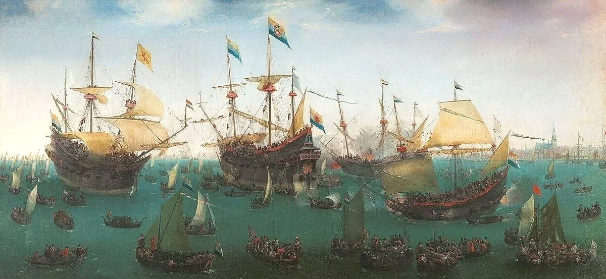
The Return to Amsterdam of the Second Expedition to the East Indies
(Hendrik Cornelisz Vroom, 1599)
Celebrates Dutch maritime success, marking the beginning of colonial expansion and the trade systems that would come to rely on slavery.

Sumptuous Still Life
(Adriaen van Utrecht, 1644)
Focused on guiding the viewer’s gaze by describing and explaining visible objects in the painting.
Depicts luxury goods—such as spices and porcelain—made accessible through colonial trade and enslaved labour, though the violence behind their origin is absent.
New label - Historical context
Provided historical context by linking the painting to slavery and colonialism, highlighting hidden histories.
No label - Control condition
Contained no textual information, leaving participants to interpret the paintings on their own.
Measurements
To understand how different labels affect visitors' emotions, engagement, and learning, multiple types of data from 63 Dutch Rijksmuseum visitors were collected and combined in the analysis


Eye-tracking while viewing the paintings and reading the labels to
Measure attention and comprehension.
Explore visitors’ engagement with different labels and paintings.
Post-viewing interviews to:
Investigate how visitors understood the paintings.
Determine if they established connections between the paintings and the history of the Netherlands.

Questionnaires to:
Measure 20 emotions (10 positive and 10 negative emotions) before and after viewing the paintings.
Determine if visitors are art-lovers (highly interested in art) or pleasure seekers (visiting the museum for entertainment).
Insights

Labels Alone Didn’t Improve Learning.
Visitors often failed to explain how the paintings are related to the history of slavery, despite seeing labels that provide historical context.
Visitors Felt Neutral or Positive.
Even when presented with the emotionally difficult topic of slavery, visitors didn’t show an increase in negative emotions.
In fact, those in the no-label and new-label (slavery-focused) groups showed a slight increase in positive emotions after viewing the paintings.
Contradictions Spark Interest.
The new label for Castle of Batavia was the most engaging.
It was the most discussed in interviews.
Eye-tracking showed the highest visual attention to this label.
The painting shows a peaceful colonial scene, but the label revealed it was misleading.
Why?
Eye-tracking, interviews, and emotional data all pointed to low engagement with the labels. As a result, the intended learning outcomes were not achieved.
Why?
Research suggests that people often emotionally disengage when content challenges their identity or beliefs.
But several factors can explain the increase in positive emotions:
Museums naturally boost mood — visiting them is often uplifting.
No-label group focused more on the art itself, reducing cognitive load and increasing enjoyment.
New-label group (slavery-focused) felt better equipped to interpret the works, which can lead to a greater sense of meaning and satisfaction.
Why?
The contradiction violated expectations, prompting visitors to rethink what they saw. This cognitive dissonance made the label more memorable and the content more emotionally engaging.
Recommendations
1.
2.
Design for Reflection: Use Neutral Questions to Prompt Deeper Thinking.
While labels didn’t spark much reflection, open-ended questions during interviews led some visitors to explore complex thoughts and emotions like pride, guilt, and sadness about Dutch colonial history.
For example, one participant talked about conflicting feelings between pride and shame about the history of the Netherlands:

“We actually stole from people there. For almost nothing. And that's how we got very rich. That's a bit of a strange feeling sometimes. We got rich on the shoulders of those people. And initially, you were proud. Because I was raised with the pride of the VOC mentality. That was it. And later I thought, well, that was a bit disappointing to me.”
Passive content is easy to ignore. But neutral, interpretive prompts invite visitors to reflect—sparking engagement and emotional insight. Emotionally charged content, on the other hand, may lead to avoidance or disengagement.
Example prompts to include in future exhibits:
What’s happening in this scene: a celebration or a conflict?
What kind of relationships do you see between the people depicted?
Design for Surprise: Use Contradictions to Capture Attention.
When interpretive content challenges expectations, it becomes more emotionally engaging and easier to remember. The new label for Castle of Batavia, which revealed the contradiction between the painting’s peaceful imagery and its colonial reality, drew the most attention and sparked the most discussion among visitors.
“What struck me was the description: that they were depicted as if they always live peacefully together, but that it's actually not like that. Then you start questioning what's true and what's not in other paintings. Artistic freedom.”
Contradictions create cognitive dissonance, a moment of discomfort that makes people stop, think, and engage more deeply. When this is done respectfully and clearly, it enhances both retention and reflection.
Use contradiction thoughtfully to explain the mismath between the image and reality of the time.