Accessible Product Listing Pages
Organisation: IKEA
My role: UX Researcher
Team: 2 Designers, Product Owner, 2 Software Engineers, 1 Inclusive Design Researcher, 2 UX Researchers
Method: Task-based remote interviews with users who have accessibility needs
Impact: Delivered actionable recommendations to make the product selection experience excellent for all users and took the first step toward making accessibility research a core part of how the UX team works
In short:
Conducted UX research with 10 assistive technology users to evaluate IKEA's product listing pages for people using screen readers, magnifiers, and speech-to-text. Findings uncovered key barriers, missing alt text, a hidden compare toggle, and an image-heavy menu, and informed actionable design improvements.
The project was also the first step in embedding accessibility research within the UX team, moving away from treating it as a separate practice and building long-term inclusive research capacity.
Why does it matter?
Increasing need: Currently, 2.5 billion people need assistive products. By 2050, this number will reach 3.5 billion.
Rising popularity: Assistive technologies like speech-to-text are increasingly used by a broader audience—including those without disabilities.
Compliance: The European Accessibility Act requires products and services to be accessible.
The curb-cut effect: Designing for people with accessibility needs ends up benefiting a much broader population.
What are assistive technologies?
Assistive technologies are products or devices that help people with disabilities, like visually impaired individuals, complete various tasks.
In the current project, we were interested in visually impaired and cognitively impaired/neurodivergent individuals who use:
screen readers;
magnifiers;
speech-to-text.
Below is a table with definitions of each technology and an explanation of how each type of technology can assist:
People with cognitive impairments/neurodivergent individuals.
Individuals with visual impairments.


Screen reader
Converts text, images, and buttons into speech.
To enhance comprehension and reduce cognitive load.
To access the content, menus, and buttons.
Magnifier
Increased the size of the contents on the screen.
To enhance focus and reduce visual overload.
To access visual content and see the details.
Speech to text
Converts spoken language into text.
To avoid spelling and typing difficulties.
To input information or perform web searches.
What did we do?
Method

Conducted remote task-based interviews
Freely exploring the product range
Looking for a specific product
Comparing products
Assessing product quality and price
Participants

Recruited 10 assistive technology users
6 visually impaired individuals
4 cognitively impaired/neurodivergent individuals
Split between mobile and desktop users
Tools used:

Analysis

Derived insights and created recommendations by
Affinity mapping
Creating short highlight clips from interview recordings
Mapping insights on specific parts of the website
Share out

Facilitated multiple share out sessions to
Present key findings to the stakeholders
Share findings and increase awareness about accessibility research with the broader organisation
What did we learn?
Generally, IKEA’s product listing pages are user-friendly and easy to navigate, providing a consistent experience when searching for products.
"It seems like a good alternative to Walmart, Amazon, or Target. It is well laid out, very reasonable, and simple to search. It is accessible, but not overly stimulating to the point that it provides too much information."
-Johan
What worked well?
What can be improved?
“I thought this was pretty well done. I would use this website again, and I would recommend it to other people who are visually impaired. I'm getting ninety-nine per cent of the information that I need.”
-Tom
Filters are easy to use and increase confidence in product characteristics.
“I'm sorting by colour specifically because for me, it can be hard to know if there's gonna be a description of the colour of each product.”
–Dana
The search bar works well with speech-to-text technology and helps to narrow down the search.
The amount and type of information about the products is appropriate and not overwhelming.
How to solve this?
Provide alternative text for sets of products, describing the items that are included in the set and their characteristics (i.e., shape and size).
"It worked really well. I feel like the amount of detail was simplified enough for me, and did not overwhelm or overstimulate me. I was really happy with that."
-Emily
“I found exactly what I was looking for: a square black table with four chairs. If I want a round one, I can just change it to a round. That’s simple. Here it is! That’s perfect, absolutely perfect.”
–Emily
“The amount of information is good! I don't want all the product info to be here (product listing page), it would make it too difficult to navigate.”
–Johan
The menu many images, but visually impaired customers do not benefit from the visual information, making it more difficult to discover products using the menu.
"I liked the search more. The menu was slower to navigate and harder to find what I was looking for. I had to know where it was.”
-Hana
How to solve this?
Provide alternative text for images so that visually impaired customers have additional input to understand the category.
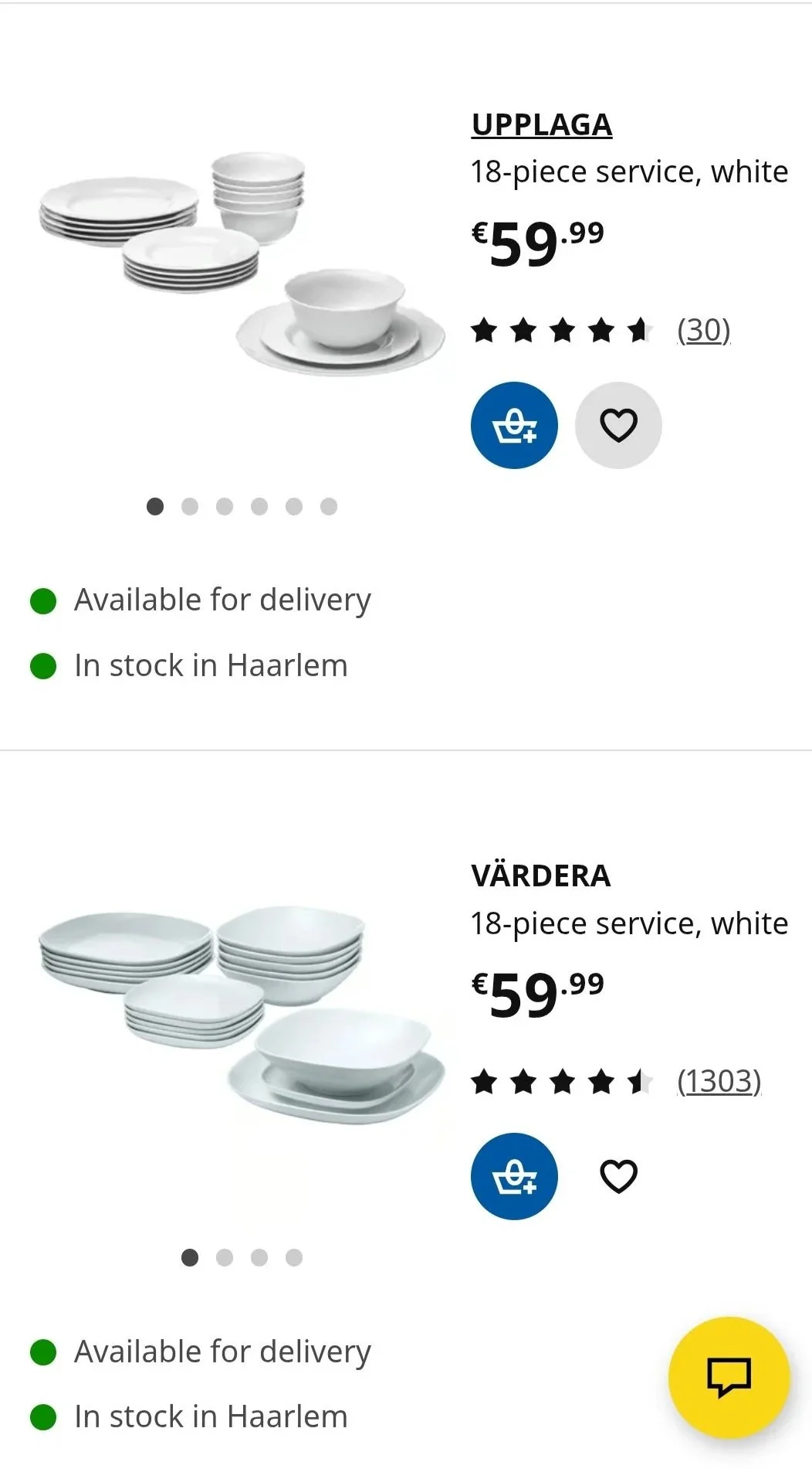
Descriptive text in the product listing page does not say what is included in the set and does not describe characteristics (e.g., sizes, shapes) of items in the set.
Screen reader describes both sets in the image as ‘18-piece service, white’.
”It tells me the brand and the colour, and it's eighteen pieces. But it doesn't actually describe what the picture is, so I don't know what's in the set.”
-Dana
The compare toggle, which enables side-by-side product comparison, is difficult to discover, with most participants missing it entirely.
Most participants didn’t use the tool at all, as they either didn’t see the toggle or the screen reader skipped it.
How to solve this?
Increase the visibility of the tool to ensure users can fully take advantage of it and make sure that the screen reader does not skip it.

What were the challenges?
Building Accessibility Research Capabilities Within the UX Team:
This was our first attempt to embed accessibility research within our UX practice. My colleague and I led the work, with guidance from an accessibility expert. It was a learning-heavy process that required experimentation, flexibility, and added time.
Recruiting Participants with Accessibility Needs:
We used Dscout, a platform we hadn’t previously used for accessibility research but chose because it claims to be accessible and offers a panel of participants with accessibility needs. It was a trial run to see if it could support inclusive research. Recruitment turned out more complex than expected, with some participants only occasionally using assistive tech. We refined our screeners and adjusted our approach, but it added time to the process.
Communicating Insights That Resonate
Conveying the experience of assistive tech users in a way that’s relatable and actionable can be challenging. While there is a growing interest in accessibility research, for teams less familiar with accessibility, these experiences can be hard to grasp.
How did we overcome them?
Solution-oriented Mindset and Adaptability Were Crucial For Completing this Project:
My colleague and I stayed closely aligned, regularly checking in and making decisions collaboratively. When unexpected issues came up, like participants not using assistive technologies as much as anticipated, we responded quickly, informed stakeholders transparently, and made calls on whether to continue or end sessions in real time. This flexible, communicative approach helped us keep momentum while still learning on the go.
Iterating Through the Process
We approached recruitment with flexibility and a willingness to learn through trial and error. Since it was our first time using Dscout for accessibility research, we spent time exploring the platform’s capabilities and limitations. We created and tested multiple screener variations, adjusting questions and criteria based on early results. Being open to errors allowed us to refine our approach quickly and ultimately recruit a more relevant and diverse set of participants.
Adjusting Content to The Audience
To make insights more relatable and actionable, we moved away from a traditional report format. Instead, we used annotated screenshots with digital post-its to highlight what worked well and what needed improvement. This made it easier for stakeholders to connect the findings directly to design decisions.
We also presented our findings to the broader organisation. To build empathy, we included a live demo simulating a screen reader experience by removing images and replacing them with alt text, helping teams better understand how users with visual impairments interact with our product.